BACK
Coinbase
Jan '26
Mobile + web
Redesigning fiat deposits
Overview
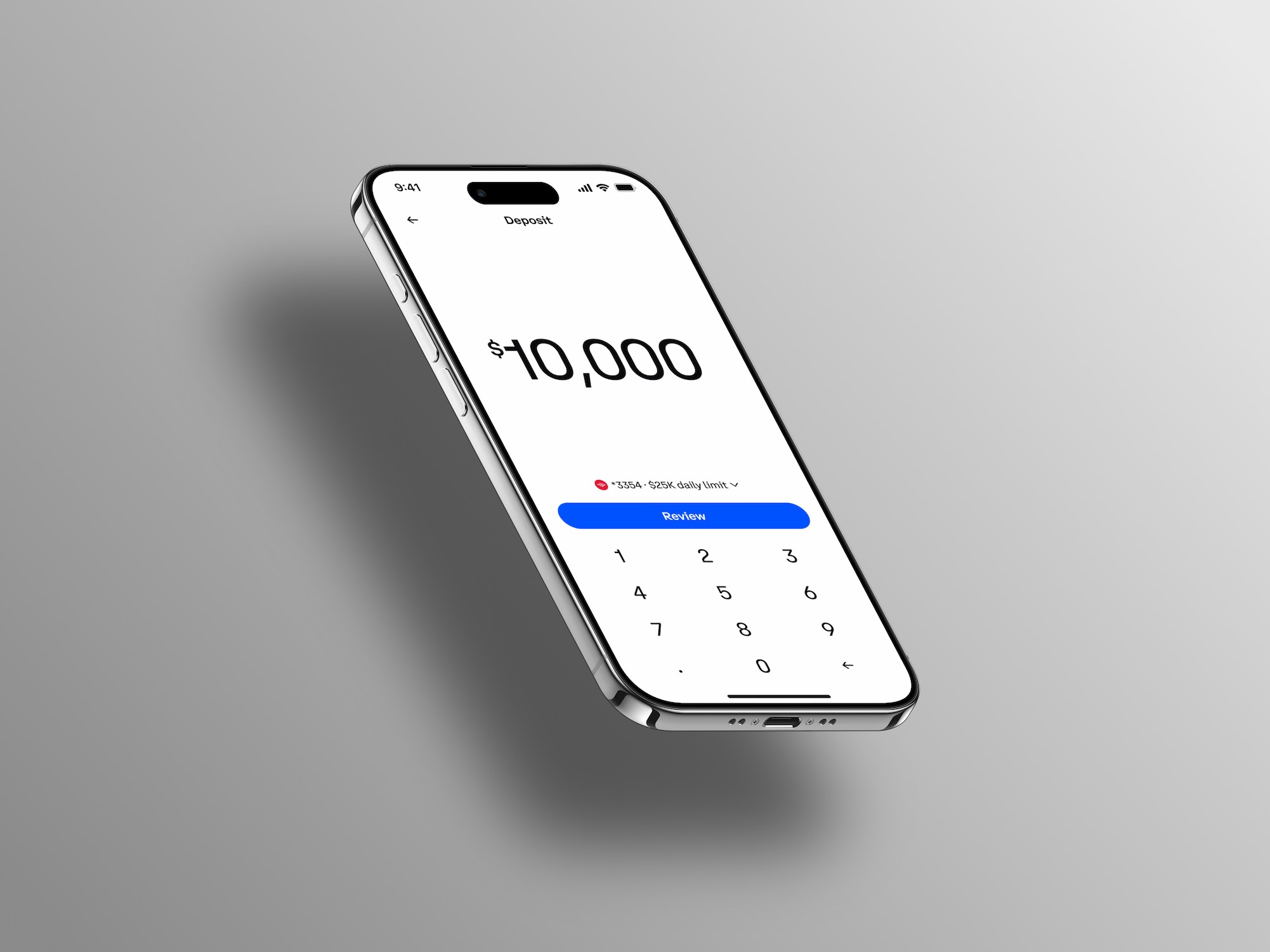
What began as a friction catalog of small paper cuts evolved into a foundational redesign of Coinbase's fiat deposit and withdrawal experience. By stripping the input screen down to essentials and pushing rarely-changed decisions to a review step, I simplified a five-decision screen into a two-step flow — improving completion rates and reducing support tickets along the way.
Problem
The deposit and withdrawal flow was underperforming on a few fronts:
Drop-off on the input screen
Latency and bugginess throughout the flow
Unclear settlement timing (when users can trade and withdraw)
What was originally framed as a catalog of minor UX paper cuts revealed deeper structural problems once we pulled the thread.

Research & Discovery
I combined existing product metrics with user research to figure out what actually mattered to users and where the real friction lived.
Key questions the research answered:
When making a deposit, do users care more about when they can withdraw or when they can trade? How much do users care about deposit currency (USD vs. USDC)? How should we signal a successful deposit and the transition into trading?
Key findings:
Users rarely change deposit currency once it's set.
Settlement timing was unclear.
The input screen was asking users to make five decisions at once, creating analysis paralysis.
The five decisions on the original input screen:
1. Deposit / Withdraw toggle
2. Frequency
3. Amount
4. Deposit currency (USD or USDC)
5. Funding source / payment method
Strategy
The guiding principle: start with the simplest possible path, then add complexity only where required.
I worked backward from the absolute minimum: what does a user have to provide to complete a deposit?
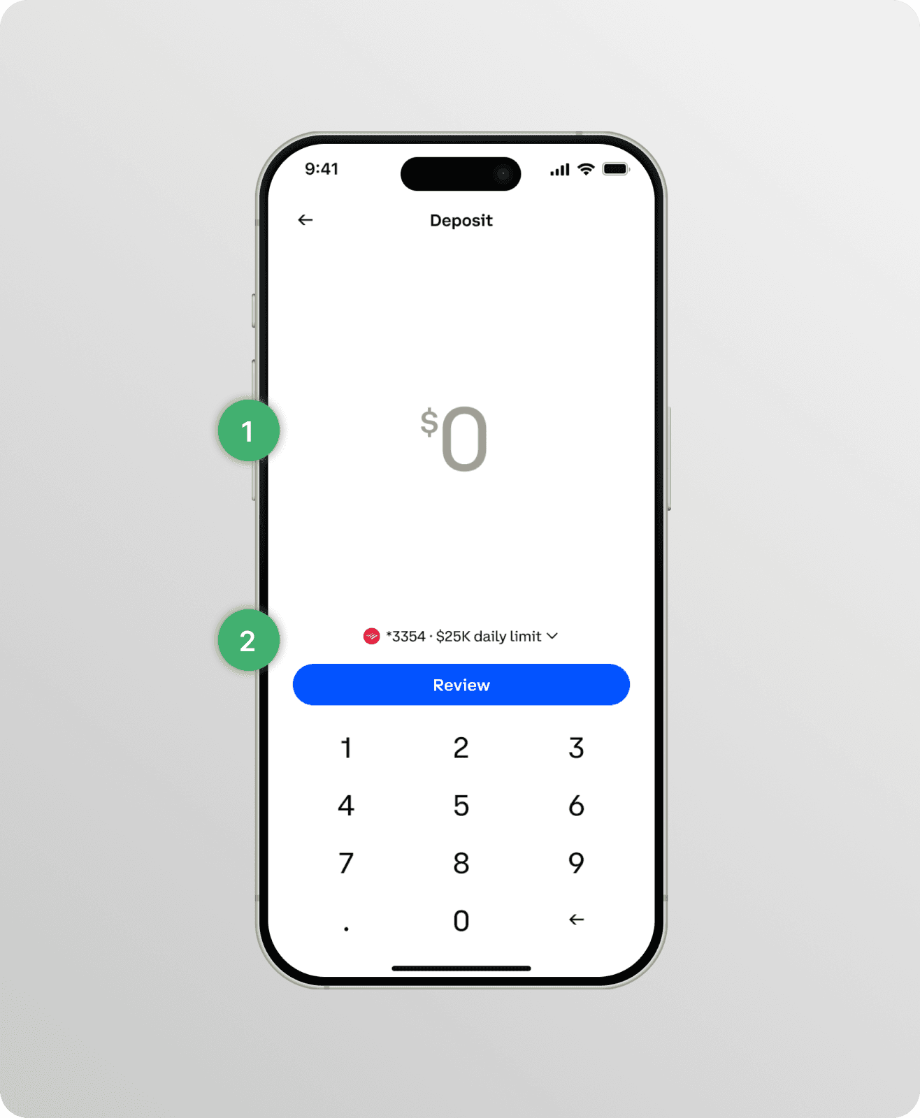
Amount input (obviously)
Payment method → determines the deposit limit


The Solution
A two-step experience: Input → Review
Amount input: Payment method (defaults to last used; users have on average ~1.2 payment methods added, so this is rarely changed)
Review screen: Frequency (defaulted), Deposit currency (defaulted), Settlement time, and Fees (if applicable)
Trade-offs & Constraints
The biggest concession was leading with payment method on the input screen for consistency with the Trade flow, which uses the same input pattern across Coinbase's core user journeys.
Optimally, payment method wouldn't appear on the input screen at all. The system would intelligently default to the payment method that allows the user to complete the transaction — for example, if a user has two payment methods added and the entered amount exceeds the limit on one, the flow would automatically select the other. This would eliminate another decision entirely.
This was a conscious trade-off: product consistency won over local optimization. Documenting the reasoning matters as much as the decision itself.

Impact
Results were directional but consistent:
Completion rates increased on the deposit flow
Customer support tickets decreased for questions about when deposits would settle
What I'd Do Differently
Push harder on removing payment method from the input screen entirely in favor of an intelligent default based on the entered amount and the user's available payment methods. The product-consistency argument is valid, but it's the kind of constraint worth revisiting as the broader system evolves.
Takeaway
The lesson that's stuck with me: design for the simplest possible path first, then add complexity only where it's actually required. Additive design, not subtractive. It's easy to start from a feature list and trim; it's harder — and usually better — to start from zero and earn every element on the screen.